
Here at High End Dabzation we receive quite a bit of inquires everyday about packaging services we are able to provide. Which...if you did not already know we are a full service packaging company that can take your idea, turn it into a logo, and eventually a fully branded beautiful package ready for you to distribute to your patiently waiting customers. Our clients come to us with a vast array of ideas so we decided to compile a little list highlighting some of the key design cases us and our customers implement to grab customer's attention and have them coming back for more. And of course build that lifelong brand loyalty.
#1 Keep It Simple
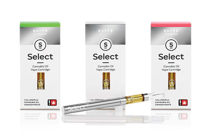
Modern tech design is making it's way to the cannabis packaging world. What used to be a vast collection of OG drawing, bubble art, and loud cannabis flowers spread throughout the packaging is now becoming subtle straight edge design curated to make the product look less like a "taboo street plant" and more like a "medicine" commonly consumed it today's society. One brand that I find does this well is Select. One of the most popular brands here in AZ and I believe across the entire USA, Select packaging is extremely minimal, simple, and gives off the impression that the product is "high end" with it's sleek Apple like coloring and design.
#2 What's on the Inside Matters
The outside of the packaging is what initially catches your attention and begins the decision making process within your brain as to whether you want to purchase the particular product or keep looking. Once you make your purchase it's what is on the inside that can really captivate a customer and make them a life long family member. Increasingly cannabis brands are placing infographics, quotes, recipes, and social media handles on the inside of their package as a clever way to create the ultimate customer experience. Grow Science Labs places an infographic handout in each of their concentrate packages that explains their cultivation process, how to store your extracts, and even company info. These extra gestures are what can really make a customer continue to buy more.
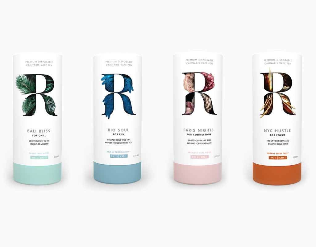
#3 Flat Pastel Colors
Another trend that is becoming increasingly popular within the Cannabis Industry is the use of trendy Instagram like palettes in logo and packaging design. Beyond just the green, purple, orange, black colors we typically see across the board with design we are seeing the use of colors that do not resemble the glorious green at all but rather embody the carefree, youthful, energetic lifestyle the ganja plant brings.
#4 Less is More.
What we are currently seeing is that the less you place on the front of the box, the simpler you keep it, less wordy, the more your brand is actually catching the eye of the consumer. I believe it's because of what tech companies have been pre wiring our brains with over the past decade. Flat, clean, minimal design flows, creates less chaos in our brains and enables us to make the decision to buy. Keep this in mind next time you design for your brand and watch your customer engagement soar.